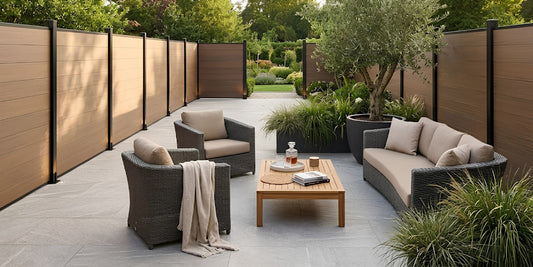

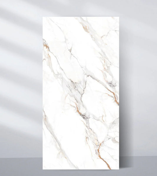
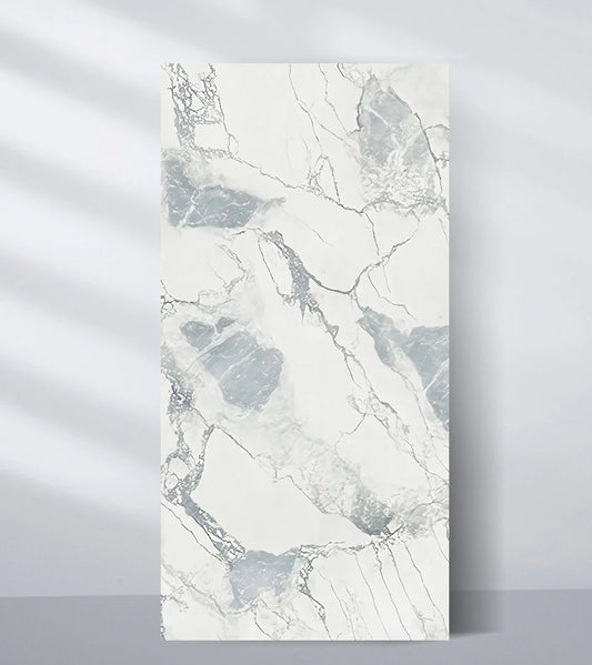
Contemporary interior design is defined by clean lines, functional beauty, and an emphasis on mood and texture. Among the many materials helping define modern spaces, WPC (Wood-Plastic Composite) fluted wall panels have carved a niche thanks to their versatility, durability, and striking visual appeal. However, their true design potential lies not just in the texture or profile but in the color combinations that designers choose.
In this blog, we’ll explore how the right color pairings can transform your space, highlight architectural elements, and contribute to an effortlessly modern aesthetic using WPC fluted panels. Whether you’re designing a cozy home office or a luxury hotel lobby, these color schemes will guide your next interior masterpiece.
Why Color Combinations Matter in Wall Panel Design
Color is not just about aesthetics it influences mood, perception of space, and the harmony between architectural elements and furnishings. When used thoughtfully, WPC fluted wall panels in strategic color combinations can:
- Define or divide zones in open floor layouts
- Make ceilings look higher or rooms feel cozier
- Accentuate focal points like TV walls, bed headboards, or entryways
- Complement or contrast furniture and lighting for dynamic layering
Unlike solid paint, fluted panels offer depth and rhythm through their grooved texture. Color combinations further elevate this rhythm, adding subtle or bold sophistication to your interiors.
Top Color Combinations for WPC Fluted Panels in Contemporary Interiors
Let’s dive into the best, trend-forward color pairings that work exceptionally well with fluted paneling in modern interiors.
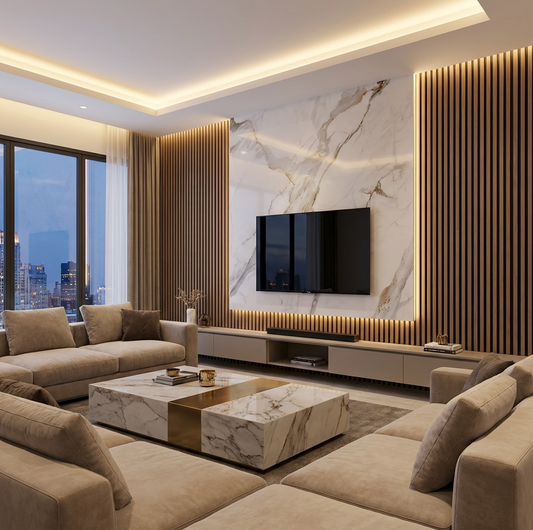
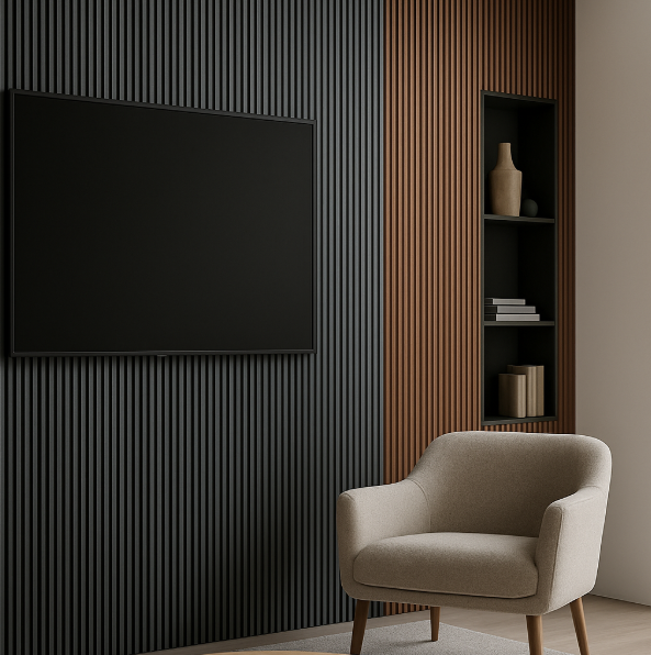
1. Charcoal Grey + Warm Walnut
Why it works: This pairing is a staple in modern design. Charcoal grey offers a sleek, contemporary tone while walnut adds depth and warmth. Together, they balance coolness and coziness perfectly.
Where to use:
- Living rooms with minimalist or industrial decor
- TV backdrops
- Home offices needing both character and professionalism
Design tip: Use charcoal on larger panels and walnut as a trim or adjacent wall finish. Add matte black light fixtures and glass shelves to complete the look.
 |
 |
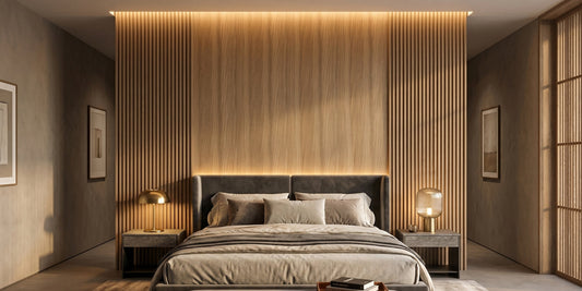
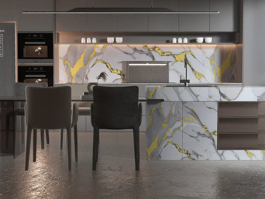
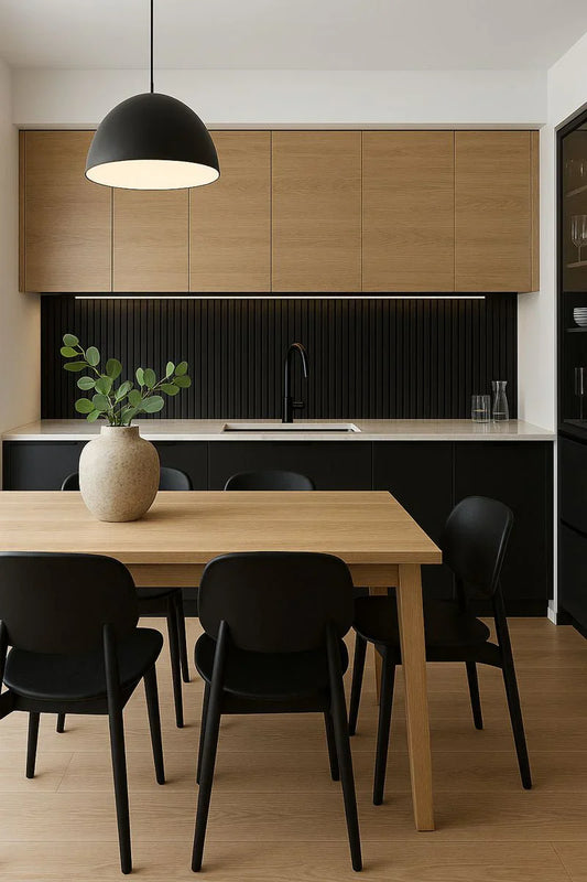
2. Matte Black + Natural Oak
Why it works: A bold yet balanced pairing that brings drama without overwhelming a space. Matte black adds depth and contrast; natural oak provides a softening touch.
Where to use:
- Entry foyers for a strong first impression
- Behind beds in contemporary bedrooms
- High-end retail interiors
Design tip: Let black panels frame or border oak panels to add structure. Incorporate warm white or golden lighting to soften the darker tones.
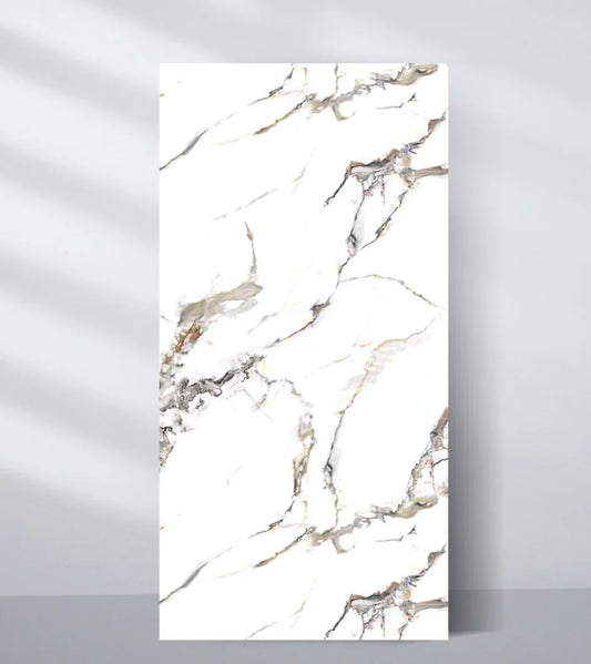
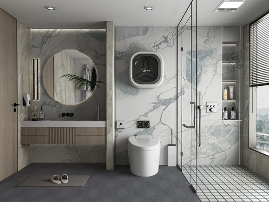
3. Ivory + Light Ash
Why it works: Perfect for Scandinavian and Japandi interiors, this light-on-light pairing evokes serenity and spaciousness.
Where to use:
- Small bedrooms or apartments
- Spa-inspired bathrooms or wellness areas
- Reading nooks or open-plan kitchens
Design tip: Keep the floor and ceiling neutral, and use layered fabrics (linen, wool) to enhance the calming palette. Add greenery for a natural pop.
4. Taupe + Espresso Brown
Why it works: This earthy combination offers timeless appeal. Taupe keeps things light and modern; espresso anchors the space with richness.
Where to use:
- Modern dining areas
- Hotel lobbies or executive lounges
- Library or study walls
Design tip: Use taupe panels on the upper half of a wall and espresso on the lower half to mimic traditional wainscoting modernized.
5. Olive Green + Beige
Why it works: Soft green tones are making a strong comeback in interiors. When paired with beige, they create a natural, organic ambiance that feels fresh and timeless.
Where to use:
- Eco-conscious design projects
- Kitchen accent walls
- Meditation or yoga rooms
Design tip: Complement with clay-colored or muted brass fixtures. Olive green should take center stage; beige should serve as the balancing element.
6. Navy Blue + Brushed Gold Trim
Why it works: For interiors that need a regal or upscale edge, navy blue brings sophistication and depth while gold adds luxury.
Where to use:
- Boutique hotel suites
- Glam-inspired living rooms
- Dining walls or cocktail corners
Design tip: Keep gold minimal just as in trim or hardware. Use indirect lighting to highlight the fluted texture and amplify the richness.
7. Terracotta + Off-White
Why it works: A modern take on Mediterranean and boho styles, terracotta adds character and warmth, while off-white tones keep it from feeling heavy.
Where to use:
- Creative studios
- Family rooms
- Kitchens with terracotta floors or tiles
Design tip: Fluted terracotta panels can be used vertically in narrow strips to add subtle depth, especially when the surrounding walls are off-white.
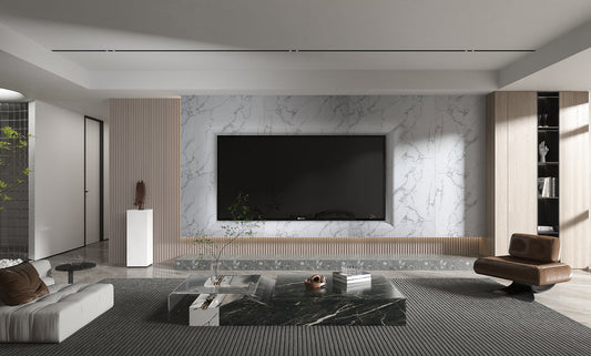
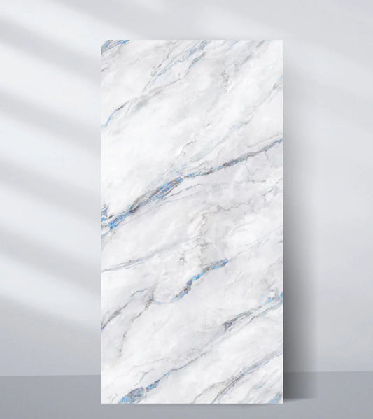
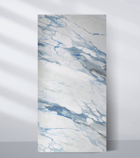
8. Graphite Grey + Teak Wood
Why it works: A futuristic yet grounded combo, graphite introduces sleek modernity, while teak maintains a natural vibe.
Where to use:
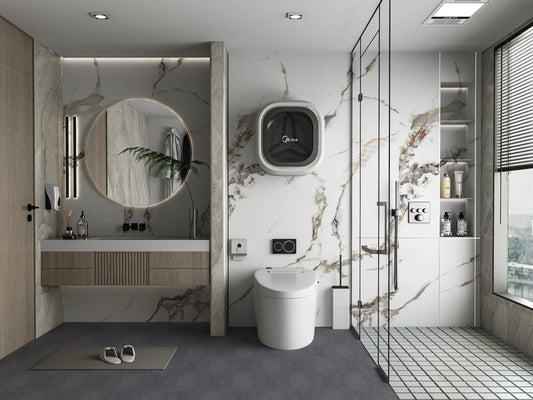
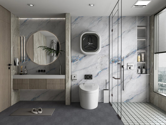
- Contemporary bathrooms
- Accent walls with built-in cabinetry
- Corporate meeting rooms
Design tip: Integrate LED strip lighting between panel transitions to enhance contrast and texture. This pairing shines under both daylight and artificial light.
 |
 |
How to Choose the Right Color Combination for Your Space
Before jumping into any trendy pairing, consider these key factors:
A. Room Size and Lighting
- Darker combos like black + walnut or navy + gold work well in spacious areas with ample light.
- Lighter palettes like ivory + ash or beige + olive are ideal for compact rooms or places with limited natural light.
B. Ceiling Height
- Use vertical fluted panels with high-contrast colors to visually raise the ceiling.
- Avoid very dark colors on tall walls in narrow spaces—they can feel overwhelming.
C. Existing Furniture and Flooring
- Match your panel colors with prominent furniture tones or flooring material to maintain harmony.
- For example, if you have grey flooring, charcoal or graphite panels will blend seamlessly; if the floor is oak, use beige, taupe, or ivory panels for cohesion.
D. Mood and Function
- Bedrooms and wellness zones benefit from calming combos like ivory + ash or olive + beige.
- Creative areas or social spaces thrive with stimulating contrasts like black + oak or navy + gold.
Styling Tips to Elevate WPC Fluted Panels with Color
- Add lighting: Use LED channels or spotlights to create shadow play and accentuate the panel texture and color contrast.
- Mix finishes: Matte finishes create calm; semi-gloss or satin adds vibrance. Mixing both in one wall design offers a dynamic visual effect.
- Go full wall: For maximum impact, cover the entire wall with panels in alternating colors or patterns.
- Frame with trim: Use metal or wooden trims to create clean transitions between contrasting colors or adjacent design materials (e.g., wallpaper or paint).
- Layer with art: Use WPC fluted panels as a backdrop for minimalistic or metallic-framed artwork to add dimension without clutter.
Final Thoughts
WPC fluted wall panels are more than just a trend they’re a lasting design feature that enhances contemporary spaces with their texture and acoustic benefits. But it’s the color combinations that truly unlock their full aesthetic power.
Whether you opt for soft and natural tones or bold and architectural contrasts, each pairing creates a unique identity in your interior. From light-filled Nordic bedrooms to moody luxury lounges, the right WPC fluted panel color combo transforms ordinary walls into expressive surfaces.
Ready to reimagine your space? Explore a wide range of WPC fluted panel options in stunning finishes and color pairings at Wall Decor’s official collection. With customization, quality, and modern elegance at your fingertips your dream walls await.
Tags:
Previous
How to Install WPC Fluted Wall Panels: A Complete Step-by-Step Guide
Next
Top Benefits of Using WPC Fluted Panels in Residential Interiors